Redesigning is an important asset to have as it creates a better experience for users and improves usability. The purpose of the project is to practice the workflow of redesigning and coding one page of a simple website with taking accessibility and responsiveness into account. This process consists of identifying the flaws of the chosen single page of the website, creating low-fidelity and high-fidelity prototypes for various screen websites, and then building a working & responsive website based on those prototypes.
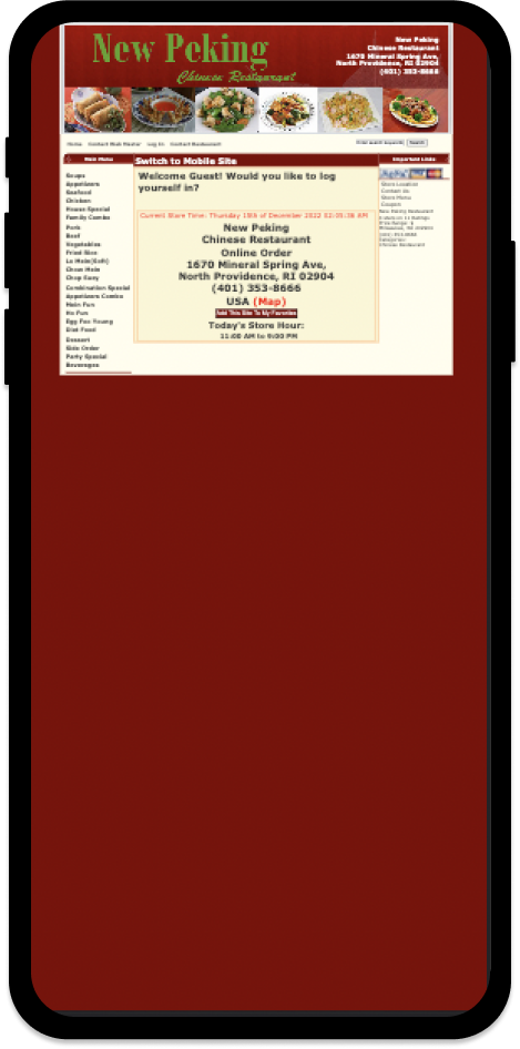
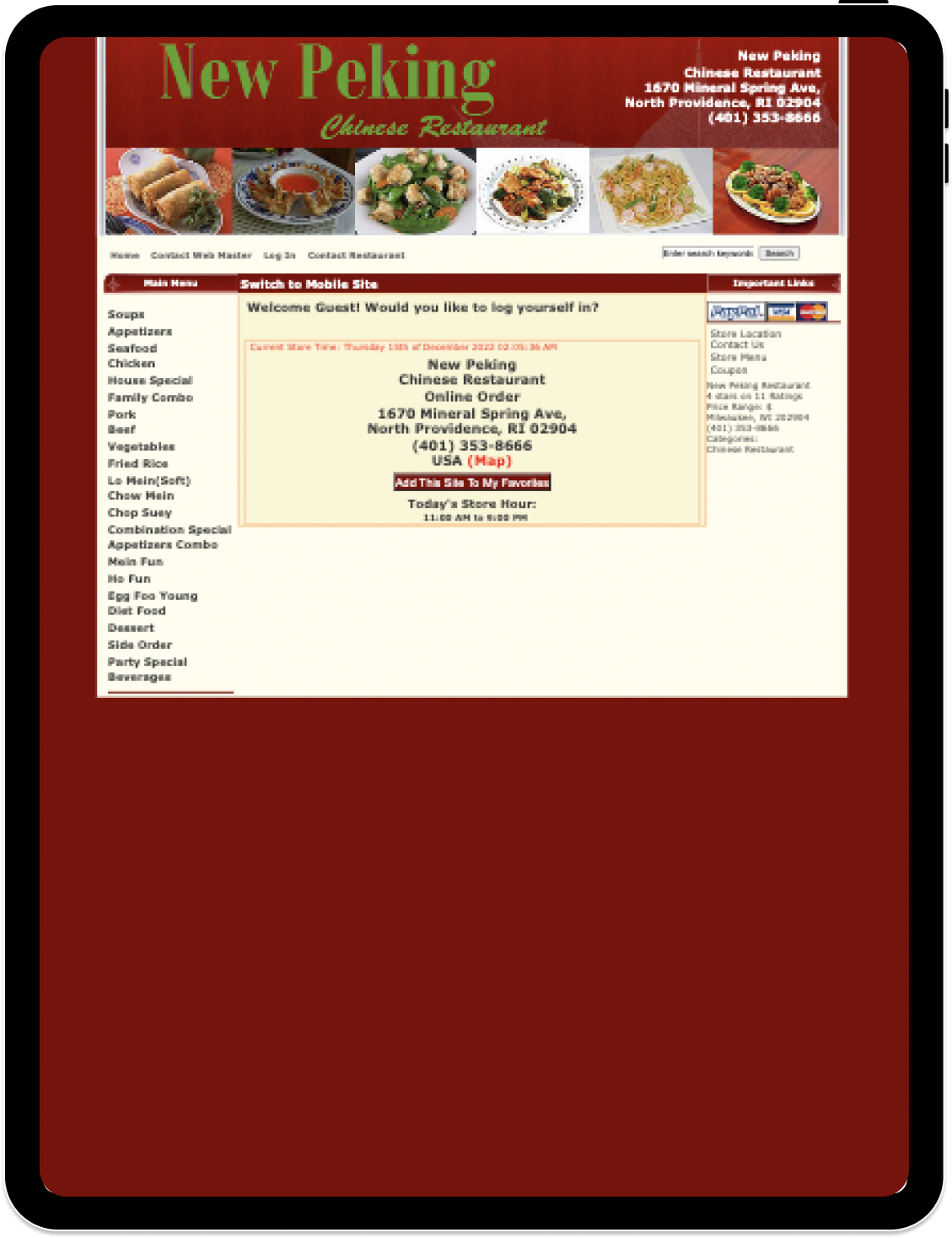
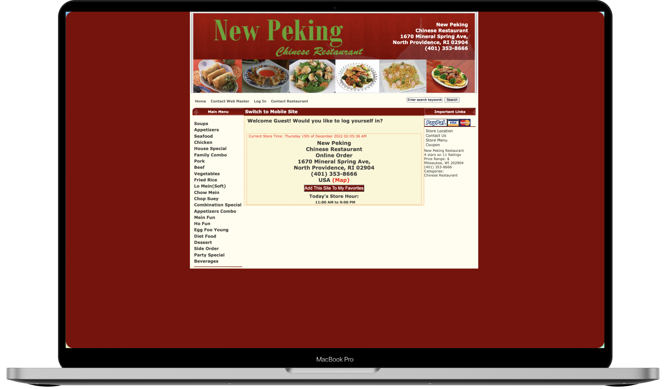
New Peking's Chinese Restaurant website was the interface that I chose for redesigning. The un-usability of the website hinders the business from attracting customers and generating additional revenue through online ordering. Because of the pandemic, online ordering has now become vital to a restaurant’s sources of revenue so that’s why there are flaws within the website that I want to improve for the restaurant to reach customers more effectively.
New Peking's Chinese Restaurant website was the interface that I chose for redesigning. The un-usability of the website hinders the business from attracting customers and generating additional revenue through online ordering. Because of the pandemic, online ordering has now become vital to a restaurant’s sources of revenue so that’s why there are flaws within the website that I want to improve for the restaurant to reach customers more effectively.
Phone Screen
Tablet Screen
Desktop Screen
Below, I first identified particular problems with the New Peking's Chinese Restaurant original page and categorize it into different sections.
I further identified problems with the orginal page by using a web accesssibility evaluation tool.
I wanted the design to be simple yet intuitive and easy to use. Using Balsamiq WireFrames, I created low-fidelity wireframes for each of the screen sizes that is generally supported (desktop, tablet, mobile respectively). On each of the prototypes, I annotated how I will redesign the original webpage in different screen resolutions, with keeping in mind the existing problems found in New Providence Chinese Restaurant webpage. These wireframes were created through the Balsamiq WireFrames application.
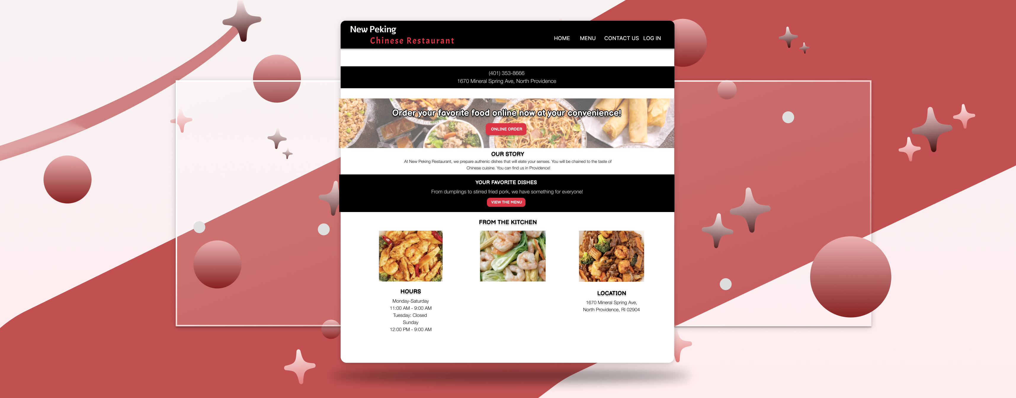
Before redesigning the original website, I built a style guide that displays the colors, typography, and interactive components of the webpage. The guide helps to ensure that the styles and interactive elements are consistent throughout the site in order for the user to have a coherent experience navigating the interface.
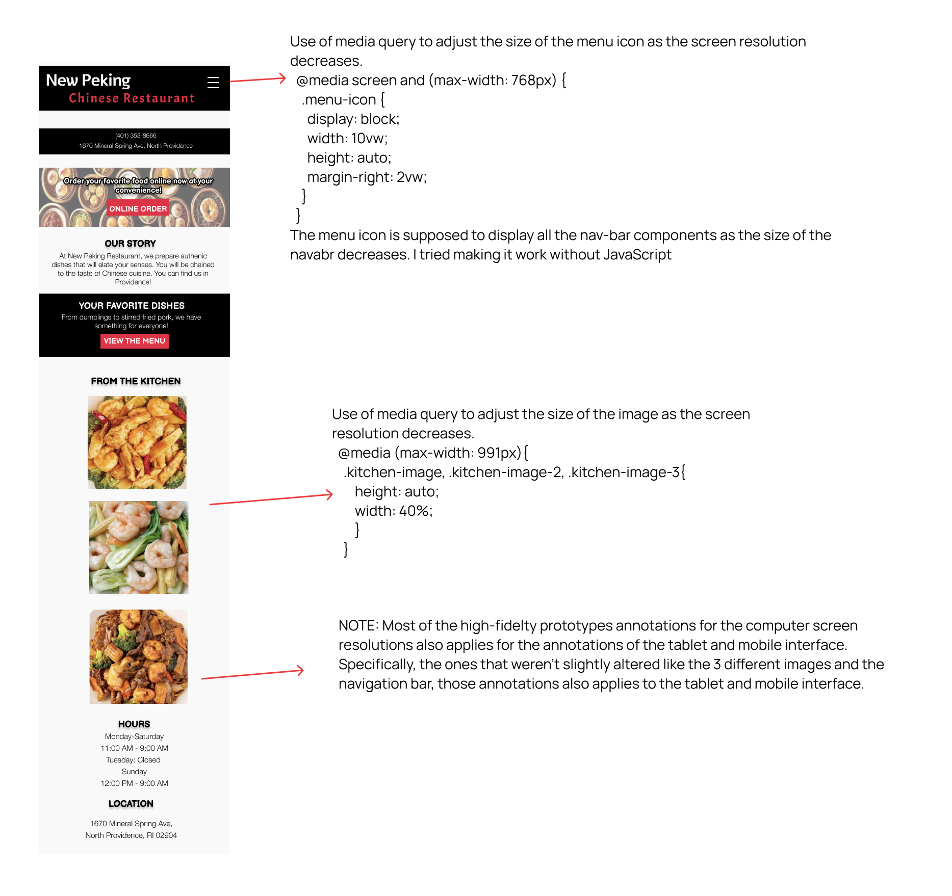
After deciding on the interactive components and styles, I expanded on the low-fidelity wireframes by using Figma to create high-fidelity prototypes for the three different types of screen resolutions (mobile, tablet, computer). These prototypes contain HTML/CSS annotations of key layout choices for others to be able to easily reproduce the redesigned website. From top to bottom, the order of the high-fidelity prototype annotations goes from computer, tablet, to phone interface.
Using the final high-fidelity prototypes, I redesigned New Peking's Chinese Restaurant using HTML/CSS, and Bootstrap Framework. This is because Bootstrap has built in components that enable responsive-friendly websites and applications. Users should take note of how all buttons and and the hamburger menu on the redesigned page are dummy elements.